Tuesday, September 25, 2018

My New SEO Tool: Ubersuggest 2.0

ubersuggest 2.0

I promised you months back that I was going to release a newer, better version of Ubersuggest for free.

And can you guess what?

I just released it! 🙂

Before I go into the features of the new Ubersuggest and how it works, I just want to tell you that not all of the features have been released yet.

For the first release, I focused on keyword research.

So let’s dive into the new Ubersuggest.

Keyword Overview

The keyword research is broken down into 3 main sections: overview, keyword ideas, and SERP analysis.

The overview looks like this:

keyword overview

The first section is a graph that breaks down the search volume over time.

keyword graph

You can see the search volume for any keyword in any country and language over the course of the last 12 months.

The graph will show you if the keyword is gaining or declining in popularity or if it has seasonality.

In addition to that, it breaks down the cost per click, the SEO difficulty, and the paid difficulty.

The difficulty scores are from 1 to 100. The higher the number the harder it will be to compete for that keyword. And the lower the number the easier it is to compete.

Keyword Ideas

The second part of the keyword research is the ideas section.

This is the section that is most similar to the prior Ubersuggest but with a few more features.

keyword ideas

You’ll see a list of keyword ideas.

The keywords are pulled using both Google Suggest and AdWords recommendations. This way you can get a comprehensive list of potential keywords you may want to rank for.

And similar to the overview section, you’ll also be able to see volume data for each keyword as well as cost per click (CPC), paid difficulty (PD), and SEO difficulty (SD) data.

Now on the right side of the keyword ideas report you’ll see all of the sites that rank in the top 100 for that term.

keyword ideas serp

This is my favorite part of the keyword ideas report because you can easily see the estimated visit count based on rankings.

This metric looks at whether a keyword has seasonality and if there are any rich snippets or paid listings for the term.

In addition to showing you the estimated visits based on rank, you’ll also see how many social shares each URL has and its domain score.

Domain score is a metric between 1 and 100. The higher the number, the more authoritative a domain is and the harder it will be to beat that site.

As for the social shares, this will tell you how much people loved that particular web page. If more people are sharing it, they must have really enjoyed it.

The last feature in the keywords idea report (other than the exporting to CSV feature which doesn’t need much of an explanation) is the filtering.

filters

This is where you can filter the keyword results based on any data point you want. From limiting the results to just Google Suggest or AdWords or by filtering keywords based on their popularity and competition.

If there are also too many results like the screenshot above, you can exclude or include certain terms or phrases. This will help you filter the results even faster.

And if you want to focus on long tail terms, just “uncheck” the “Google Ads” option and you will see all of the long tail terms.

SERP Analysis

The last section, SERP analysis, shows you a simple view of the top 100 sites that rank for any given term.

serp analysis

I know many of you are doing keyword research in different languages and regions and you’ll be able to do that with all of the reports, including the SERP analysis.

Eventually, I’ll showcase rich snippets and paid advertising data in this report.

We are already taking those two things into account when we run our calculations on estimated visits.

And of course, you’ll also see social share data and domain score.

So, what’s next?

I wish I was able to release everything at once, but development is never easy or fast. I have an amazing team… but good things just take time.

A few of the features I want to release over the next few months include a traffic analyzer report, which shows how much traffic a domain receives from Google.

traffic overview

Another feature I will release will be a report that showcases top pages for any given website and the search terms that each of those pages rank for.

top pages

Once I release the traffic analyzer report, the team will be focusing on the content ideas report.

content ideas

The content ideas will be part of the keyword research section.

When you research any keywords, you’ll be able to see the most popular articles on that subject based on search traffic and social shares (similar to Buzzsumo).

Conclusion

What do you think about the new Ubersuggest? If you haven’t used it, go check it out.

And if you find any bugs, please email them to support@neilpatel.com so my team and I can work on fixing them.

Like I mentioned earlier, this is a work in progress and other amazing features are already being worked on for future release. A lot of these ideas come from you guys so, please, the more feedback the better.

So, what do you think about the new Ubersuggest?

The post My New SEO Tool: Ubersuggest 2.0 appeared first on Neil Patel.

Tuesday, September 18, 2018

The Secret Behind My 1,866,913 Monthly Search Visitors (It’s Not What You Think)

secret

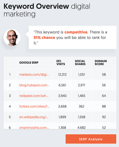
How many visitors do you think NeilPatel.com generates each month?

Maybe a million… maybe 2 million?

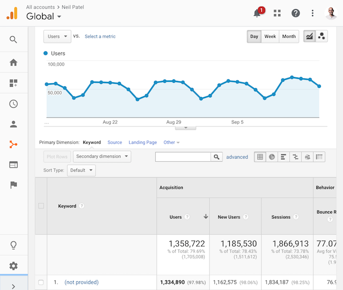
I bet you’re going to guess 1,866,913.

If that’s what you guessed, you are wrong. This blog actually generated 2,530,346 visitors. 1,866,913 is the number that came from search engines.

google graph

So, what’s the secret to my ever-growing Google traffic?

Sure, I have optimized my on-page SEO, I’ve built links, written tons of blog post… I’ve done all of the stuff that most of my competition has done. But doing the same stuff as your competition isn’t enough.

My secret sauce is that I optimize for user signals.

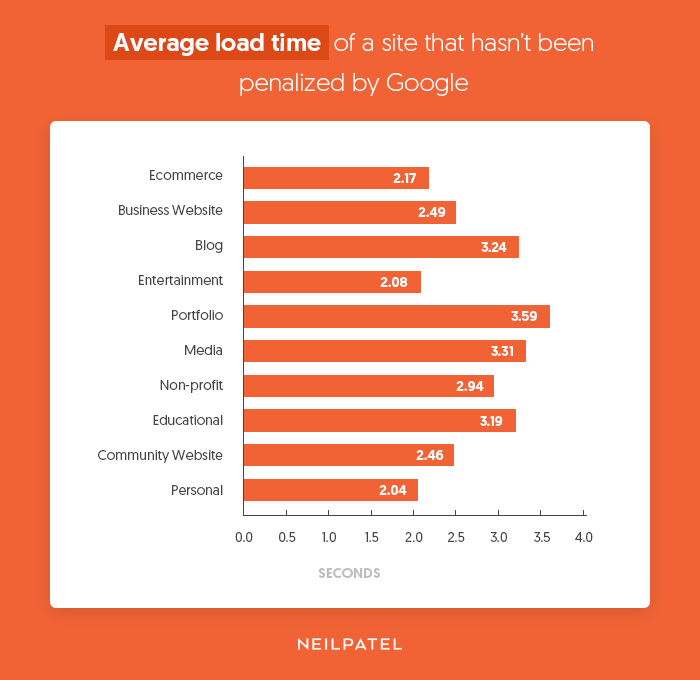
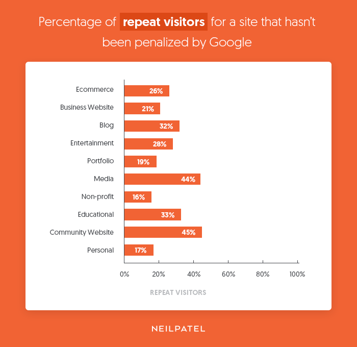
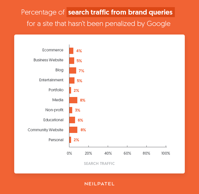
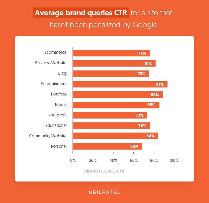
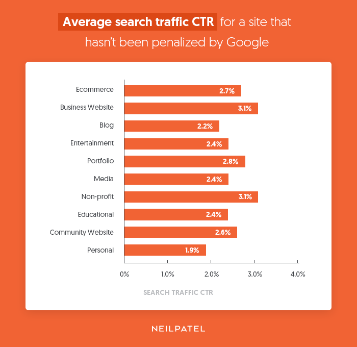
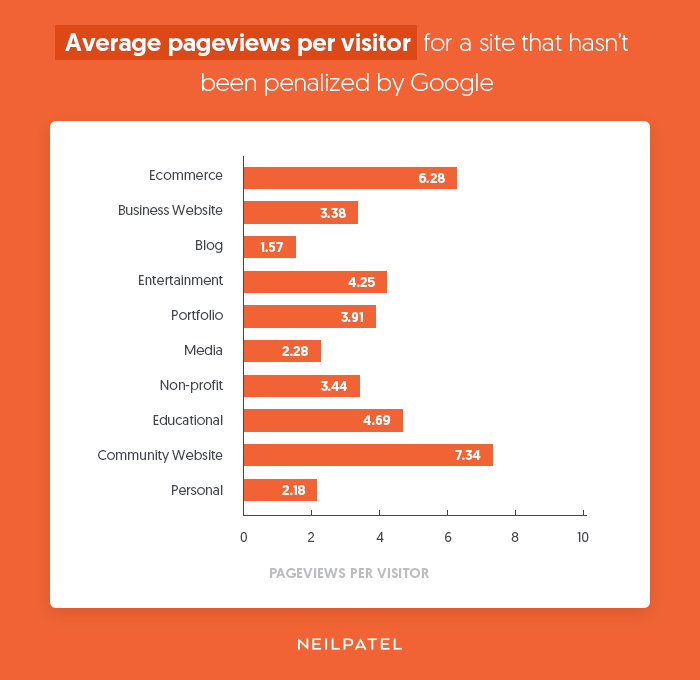
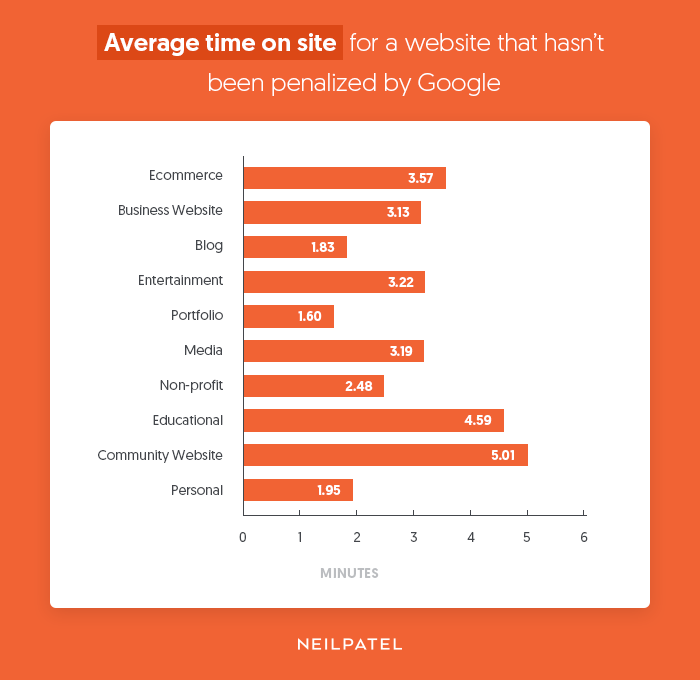
Last week, I broke down some of the user signals Google looks at, as well as providing benchmarks to aim for if you don’t want to be penalized by Google.

If you aren’t familiar with user signals, check the article I linked to above.

So, how do you optimize for user signals?

Well, I know everyone has different types of websites, so I thought I would share the process I use to optimize NeilPatel.com.

Are you showing people what they want?

Google Analytics is an amazing tool. I’m so addicted to it that I log in at least 3 or 4 times a day. Heck, I even log in on weekends.

But here’s the thing, it only tells you half the story. It gives you numbers, but it doesn’t help you visualize what people are doing and what they aren’t.

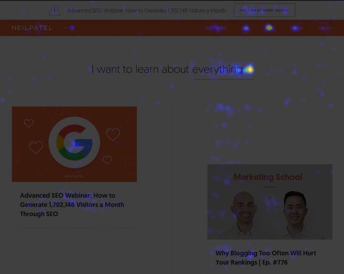
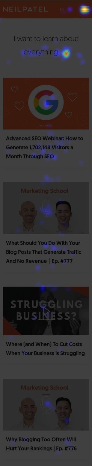
For example, here is what my main blog page looked like according to Crazy Egg:

blog heatmap

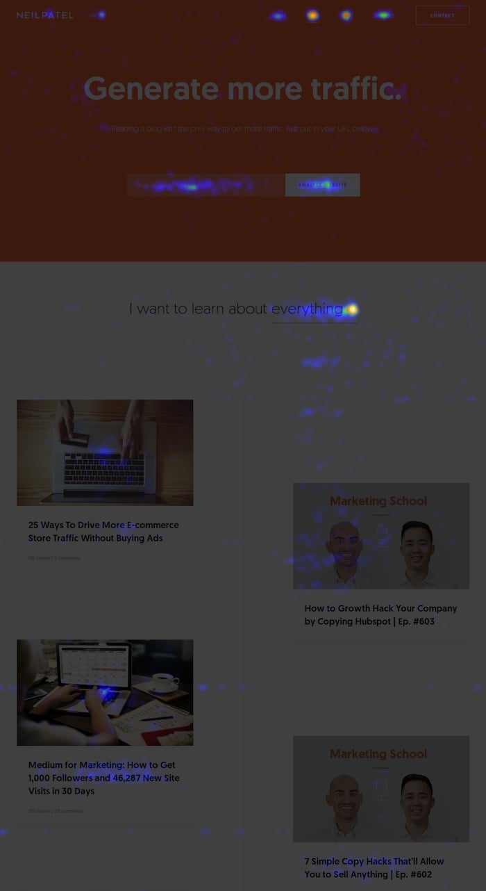
What’s wrong with the image?

Everyone is going to the blog to learn more about marketing. Above the fold, I have a box that showcases an SEO Analyzer. But there is one big issue: it’s barely clicked compared to the drop-down that lets you filter the blog content.

The SEO Analyzer had 128 clicks versus 359 clicks to the content filtering option.

Because you didn’t care for it as much, I removed it from the main blog page. And now when you head to the blog page you can see the filtering options above the fold.

new blog

I am looking to see what you click on and what you don’t. Simple as that.

If I keep showing you something you aren’t clicking on, I am wasting the opportunity to present you with something you do want to see. Which means I either need to adjust it or delete it.

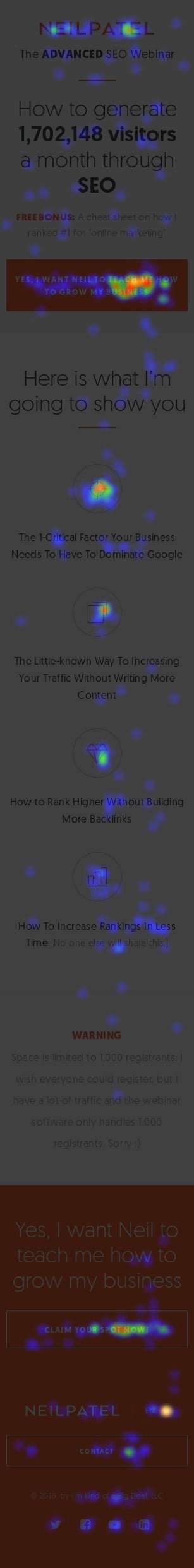
Now, let me show you my current homepage:

homepage

What’s wrong?

Go ahead, take a guess…

Well, looking at the image you’ll notice there are tons of hot spots in the footer. That’s where the navigation is. With there being all of the clicks on the navigation, I should consider adding a navigation menu bar in the header.

Are you getting the hang of how to make your website more user-friendly? Well, let’s try another one.

Here’s an element in the sidebar of my blog posts:

blog sidebar

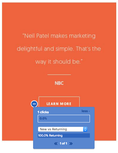
That element only has 1 click. That’s terrible considering that the blog post generated 10,016 visits. And to top it off, that click came from a repeat visitor.

My goal is to convert more first-time visitors into leads, which makes up the majority of my visitors, but they are the lowest percentage of my leads.

new visitors

So, what did I do? I deleted that element and you no longer see it in my sidebar.

Are you optimizing for mobile?

Let’s face it, more people are visiting your site using mobile devices than laptops or traditional computers.

If that’s not the case, it is just a matter of time.

So, have you optimized your site for mobile? And no, I’m not just talking about having a responsive design because everyone is doing that these days.

mobile homepage

If you look at the image above, you’ll notice that I removed the image of myself and a few other elements. This helps make the loading experience faster and it helps focus people’s attention on the most important elements.

Similar to the desktop version, my mobile homepage has a 24% conversion rate. When my mobile version included a picture of me above the fold, my conversion rate dropped to 17%… hence there is no picture of me. 😉

Now, I want you to look at the mobile version of my main blog page and compare it to my homepage.

mobile blog page
Do you see an issue? The blog page generates a lot of clicks on the 3 bars at the top… that’s my navigation menu. My developer accidentally removed that from the mobile homepage, hence the contact button in the footer of the homepage gets too many clicks.

Hopefully, that gets fixed in the next day or two as that could be negatively impacting my mobile rankings.

On top of optimizing the mobile experience, you need to ensure your website loads fast. It doesn’t matter if people are using LTE or 4G, sometimes people have terrible reception. And when they do, your website will load slow.

By optimizing it for speed, you’ll reduce the number of people who just bounce away from your site.

If you want a faster load time, follow this.

And don’t just optimize your site for speed once and forget about it. As you make changes to your site, your pagespeed score will drop, which means you’ll have to continually do it.

For example, you’ll notice I have been making a lot of change to NeilPatel.com (at least that is what the heatmaps above show). As I am making those changes, sometimes it affects my pagespeed score negatively. That means I have to go back and optimize my load time again.

A second in load time delay on average will cost you 6.8% of your revenue.

Are you focusing on helping all of your users?

Not every person who visits your website is the same.

For example, a small percentage of the people who visit NeilPatel.com work at large corporations that are publicly traded and are worth billions of dollars.

And a much larger percentage of my visitors own small and medium-sized businesses. These people are trying to figure out how to grow their traffic and revenue without spending an arm and a leg.

And the largest percentage of my visitors don’t have a website and they are trying to figure out how to get started for free.

In a nutshell, I have three groups of people who visit my website. The first group tends to turn into consulting leads for my agency, but they make up the smallest portion of my traffic.

One could say that I should only focus on helping them and ignore everyone else. But I can’t do that for a few reasons…

  1. I started off with having practically no money and people helped me out when I couldn’t afford to pay them. I love paying it forward and helping people who can’t afford my services because I have been there, and I know what it’s like.
  2. If I only focused on the large companies, who would link to my website and promote my content? You can bet that Microsoft isn’t going to link to me on a regular basis. If you want to generate social shares and backlinks you have to focus on the masses.
  3. Little is the new big… if you can please the masses, they will make noise and the big players will eventually hear about you. So, don’t just treat people with deep pockets kindly, treat everyone the same and truly care about your visitors.

Once you figure out the types of people coming to your website (and if you are unsure just survey them), go above and beyond to help them out. Create different experiences for each group.

On NeilPatel.com, I’ve learned that people who work at large corporations are busy and they want to listen to marketing advice on the run. For that reason, I have the Marketing School podcast.

And a lot of beginners wanted me to break down my steps over video, so they can more easily replicate my tactics. For that reason, I create new videos 3 times per week giving marketing and business advice.

Many of you want to attend the conferences that I speak at, but can’t afford to buy a ticket. For those people, I create weekly webinars that are similar to the speeches I give at conferences.

And best of all, I know the majority of you find it hard to follow along with all of these tips as it can be overwhelming. So, I created Ubersuggest to help you out.

ubersuggest

In other words, I try to go above and beyond for all of my visitors.

Yes, it is a lot of work, but if you want to dominate an industry it won’t happen overnight. Expect to put in a lot of time and energy.

Are you taking feedback from people?

You are going to get feedback. Whether it is in the form of email or comments, people will give you feedback.

It’s up to you if you want to listen… but if a lot of people are telling you the same thing you should consider it.

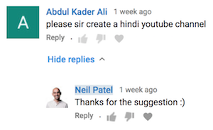
For example, I get a ton of comments on YouTube from people asking me to create videos in Hindi.

hindi

And…

hindi

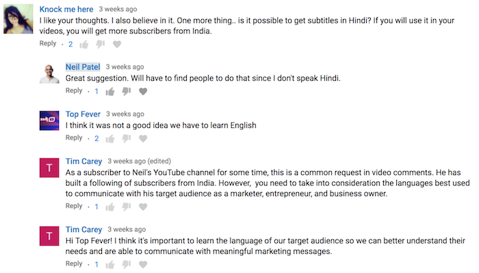
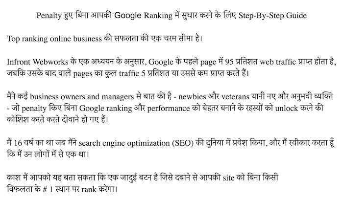
Now, I am not only working on adding Hindi subtitles to my videos, but I am also working on translating my blog content to Hindi.

hindi content

I’m not doing these to make more money… I’m not doing this to become popular… I’m just trying to do this to help out more people.

It’s the same reason why I have Spanish, Portuguese, and German versions of this website. I had enough requests where I pulled the trigger even though I am not focusing on generating income in those areas.

But here is the thing that most people don’t tell you about business. If you just focus on helping people and solving their problems, you’ll notice that your income will go up over time.

Businesses make money not because their goal is to make money… they make money because they are solving a problem and helping people out.

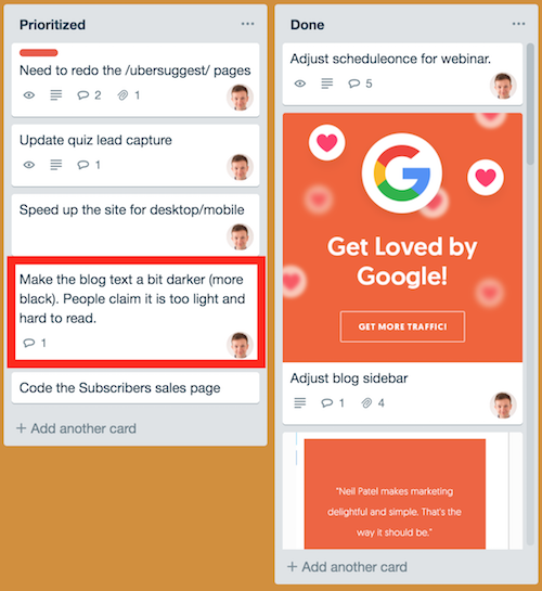
Another piece of feedback I have been getting recently is that my blog is too hard to read on mobile devices.

hard to read

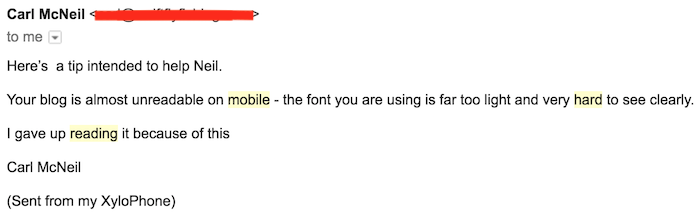
For that reason, I’ve assigned a task to one of my developers to fix this.

trello

Conclusion

Traffic generation is a business. It’s not a hobby. It’s competitive, and it’s difficult to see short-term gains.

If you want to rank at the top of Google, you can’t treat your website as a hobby. You have to treat it like a business.

And similar to any business, you won’t succeed unless you pay attention to the needs of your customers. That means you have to listen to them. Figure out what they want and provide it.

That’s what Google is trying to do. They are trying to rank sites that people love at the top of their search engine. If you want to be one of those sites, then start paying attention to your visitors.

Show them what they want and go above and beyond so that they will fall in love with your website instead of your competition.

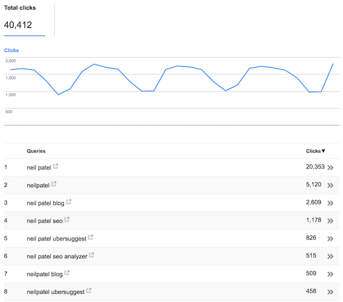
If you aren’t sure if you are making the right changes, monitor your brand queries. The more people that are searching for your brand terms on Google is a big leading indicator that people are happy with your website.

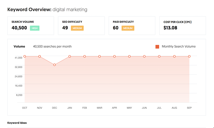
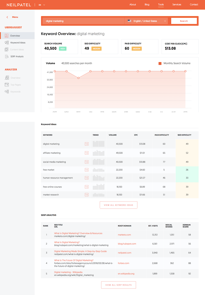
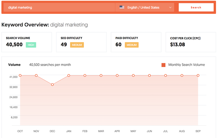
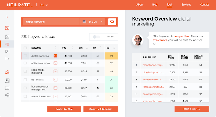
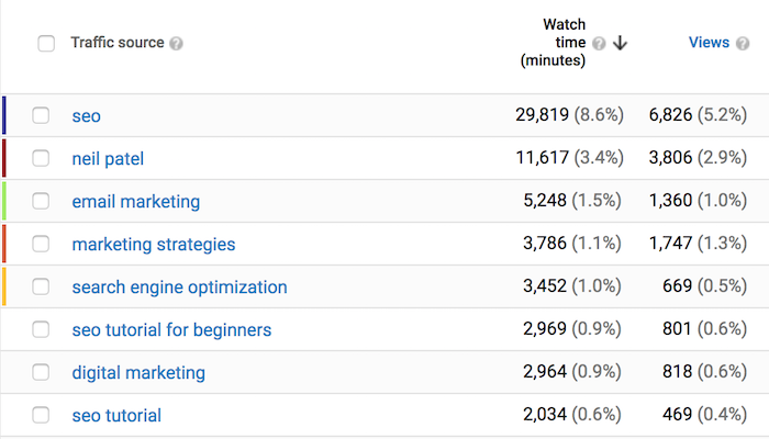
Just look at NeilPatel.com, I get over 40,000 visitors a month from people Googling variations of my name:

search console brand queries

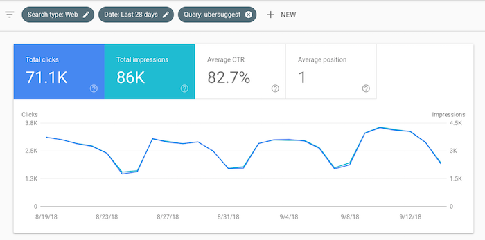
And I generate over 70,000 visits a month just from people searching for my free tool, Ubersuggest.

ubersuggest

That’s how I’m continually able to make my traffic grow. Yes, I do pay attention to what Google loves, but more importantly, I pay attention to your needs and wants.

Are you going to start optimizing your website for user signals?

The post The Secret Behind My 1,866,913 Monthly Search Visitors (It’s Not What You Think) appeared first on Neil Patel.

Tuesday, September 11, 2018

What Do Sites That Have Never Been Penalized by Google Look Like?

google love

User signals!

It’s the one thing SEOs don’t optimize for.

I don’t know why most SEOs ignore this metric considering how important it is to Google.

See, Google doesn’t care to put the website with the most backlinks at the top or the best on page SEOthey want to put the website that you and other people love at the top.

That’s why they look at user signals.

Now, if you aren’t familiar with user signals, check out this experiment by Rand Fishkin that I discussed in a recent article.

It shows that if everyone performed a Google search and clicked on the 4th listing instead of the first one, the 4th skyrockets to the top spot almost instantly.

I’m not saying you should tell your users to click on your listings over the competition. Instead, you should focus on the user. Because if you can make users love your site, then you will rank higher over time.

So, my team and I thought it would be fun to look at the Google Analytics accounts of websites that have never been impacted negatively from a Google algorithm update to see what type of sites Google loves to rank (and their user signals).

By looking at metrics related to the user such as bounce rate, time on site, pageviews per visitors (and 5 other signals), we were able to come up with benchmarks that you should aim for.

We ended up analyzing 518 sites. But before we go into our findings, here are some notes about the data:

  1. Each website had to have been around for at least 3 years. We didn’t look at any brand new websites because they wouldn’t have been around long enough to figure out if Google loved or hated them.
  2. Each website had at least 5,000 monthly visitors a month from Google.
  3. We excluded sites there were in Alexa’s top 1,000 list. Plus we didn’t really have any data we could share from any of those sites.
  4. We exclude any company that was generating over $100,000,000 in revenue. I know that seems high, but we needed a ceiling. When you start looking at data from extremely popular companies, it really skews the data.
  5. We bucketed sites into 10 different categories and we looked at both B2B and B2C sites.
  6. All of the data was gathered using Google Analytics and Google Search Console.

Let’s start.

User signal #1: Bounce rate

You’ve heard the term bounce rate before. And you know that you want to get it as low as possible. But before I get into that, let’s break down the definition:

The percentage of visitors to a particular website who navigate away from the site after viewing only one page.

We found that Google loves sites that have a bounce rate between 26% and 69%:

bounce rate

Based on the type of site you have, you should aim to have a bounce rate as close to (if not better than) the sites above.

If you have a bounce rate that is higher, just follow these 13 steps to help reduce it.

User signal #2: Mobile friendliness

Roughly 60% of all searches take place on a mobile device.

Because more people search Google using a mobile device and due to the fact that they have a mobile-first index, we thought it would be wise to see if sites that are in the good graces of Google have a mobile-friendly site.

mobile friendly

As you can see, all 518 sites had a mobile-friendly site. In almost all cases, they didn’t have a “separate” site just for mobile, instead, their website was responsive.

This also makes sense because these days you have to think mobile first when you are designing or creating any website.

If your website isn’t responsive, you should get that fixed ASAP.

And I know some of you are probably wondering about AMP. Most of the sites we looked at were not leveraging the AMP framework as they weren’t all blogs.

User signal #3: Average load time

This is the only metric we didn’t leverage from Google Analytics or Search Console. Instead, we ran each website through Pingdom.

average load time

In general, the faster your website loads the better off you are. Why would you want people to have to wait 5 or 10 seconds for your site to load? I know I don’t like waiting.

Google not only uses it as a factor within their algorithm but the slower your site loads the fewer sales you will generate.

If an e-commerce site is making $100,000 per day, a second in load time delay will roughly cost you $2.5 million in lost sales each year.

If you want to improve your load time in the eyes of Google, check out this Page Speed Insights tool that they have. It breaks down exactly what you need to fix.

Don’t worry about getting a perfect score, just get as high as possible.

User signal #4: Percentage of repeat visitors

No one really knows the exact factors Google uses in their algorithm.

And no one has proof if Google is using data from Google Analytics, Chrome, or toolbars (as far as I know). But if I had to guess, I would say there is a high chance they are assuming it is legal.

One of the signals I would look at is repeat visitors. The fact that someone keeps going back to a website tells Google that it has loyalty and people love it.

repeat visitors

As you can see from the graph above, websites that have done well on Google have anywhere from 16% to 45% repeat visitors.

When you are starting off, your repeat visitor count is going to be extremely high because it’s going to be you and your friends continually going back to your site.

But as you grow, you’ll notice that it will drop to less than 10%. To get visitors continually coming back to your website, you’ll want to use tools like Subscribers.

It’s a simple tool. It uses browser notifications to get people back to your site.

push traffic

As you can see from the screenshot above, I used Subscribers to get 42,316 people back to my site 174,281 times.

User signal #5: Percentage of search traffic from brand queries

I’ve blogged about this in the past and have even shown you how my search traffic started to climb as my brand queries grew.

Just as a quick recap, I found that as more people Googled “Neil Patel” or variations of it, Google started to rank my site for other terms like “online marketing.”

Once I learned that brand queries help, I spent more time on building a brand. Now during any given month, I generate roughly 40,412 visitors per month from brand related terms:

brand queries

I even generate 3,806 brand queries on YouTube:

youtube searches

It’s not just me either. Sites that continually dominate Google also have brand queries as a portion of their search traffic.

brand searches

And these sites aren’t just getting people to search for their brand, but a high portion of those searches land back to their site. In other words, their brand queries have a high click-through rate.

brand queries ctr

If you want to dominate Google, you need to build a brand.

The bigger your brand and the more loyal people are to it, the more search traffic you’ll get over time.

If you aren’t familiar with how to build a brand, check out hack number 3 in this article that I recently wrote.

User signal #6: Click-through rate

Speaking of click-through rate, we thought it would be interesting to analyze everyone’s Google Search Console to see the click-through rate these sites had.

search traffic ctr

Most of these sites had click-through rates between 1.9% and 3.1%.

If your website has a low click-through rate, you can improve it by following these 13 steps.

My best advice is to continually A/B test your title and meta description tag to see if you can make it more appealing so that more people want to click on your search listing as opposed to your competitor’s.

User signal #7: Pageviews per visitor

If someone continually browses your site and visits many pages, you are usually doing something right because it means that people like your content, product, service, or whatever else you are offering.

Of course, you can game the system by writing a really long article and only putting a few hundred words on each page and make people click a “next” button to keep reading more.

But that’s a terrible user experience and you don’t want to do that.

You want people to naturally want to visit tons of pages on your website without having to trick them.

So how many pageviews per visitor do high ranking sites have? Well, here’s the average:

pageviews per visitor

If you want to boost your pageviews per visitor, just follow the tips in this article.

User signal #8: Average time on site

You don’t want people to leave your site… unless they are going to buy something or click on ad.

You want them to stay on your site as long as possible.

time on site

As you can see from the chart above, websites that ranked well on Google were able to keep people around for at least 1.6 minutes if not all the way up to 5 minutes.

Now the 5-minute number is going to be a bit tough, but if you can keep people on your site for over 2 minutes you are going to do well.

Plus, you’ll have fewer chances of getting hit by a Google Panda penalty.

This article will teach you how to keep people on your website longer (without tricking them).

Conclusion

To dominate Google, you need to think like Google. It’s not just about gaming the system and tweaking your site so that Google loves you.

It’s more about understanding their main objective, which is to put the user first.

That means that if you also put the user first, in the long run, your rankings should slowly climb.

Now, this doesn’t mean you can ignore normal SEO practices like on-page SEO and link building, but instead, you need to do all of that in parallel with focusing on the user.

So how do your metrics stack up with the benchmarks above?

The post What Do Sites That Have Never Been Penalized by Google Look Like? appeared first on Neil Patel.

Tuesday, September 4, 2018

We Analyzed 5,860,631,392 Articles From 64 Countries. Here’s What Facebook Loves!

data marketing facebook

Facebook reach has continually declined over time.

Nowadays everyone tells me there is no point in even sharing content on Facebook.

But you know what? You can still generate traffic from Facebook.

Yes, traffic has declined. Even so, in the last 31 days, I’ve generated 20,420 visits from Facebook.

facebook traffic

That’s not too shabby considering I’m only publishing 4 articles a month. That’s an average of 5,105 visitors per article from Facebook.

And because I’ve been building the ultimate SEO tool, I’ve been gathering social sharing data on over 9 billion URLs.

database size

But a large portion of the URLs in our database aren’t articles. So, for this analysis, we looked at 5,860,631,392 articles.

Before I dive into what we have learned, there are few things you ought to know about the data:

  1. Technically we have gathered social sharing data on 11,721,262,784 articles. For each URL we gather data on the HTTP and the HTTPS version to get an accurate count as more sites have transitioned to HTTPS over time.
  2. We only looked at articles. A lot of URLs such as nike.com have over a million Facebook shares, but they aren’t articles.
  3. We looked at articles in multiple languages as English isn’t the main language everyone speaks in the world.
  4. When I say “social shares”, that includes reactions, comments, and shares from Facebook.
  5. We excluded scraper sites. A lot of the articles shared on Facebook are scraper sites. They barely have any shares and it skews the data.
  6. In total, the 5,860,631,392 articles came from 163,968,722 domains.
  7. Our list of articles started with Google search results. Because we have data on 507,348,976 search engine results from 64 different countries, we were then able to find the sites that you read on a regular basis, which then helped us crawl and find more articles that you may read.

Let’s dive into the learnings.

What type of content generates the most Facebook likes overtime?

There’s been countless articles published showing that list posts and infographics generate the most social shares.

And that makes sense because who doesn’t love a visual piece of content such as an infographic?

But what if you want social shares over time?

By looking at how many social shares each article generates on a monthly basis, we were able to see the growth rate and the types of article that generate the most social shares over time.

Here’s the share growth rate over time per article type:

how to

If you want a quick boost in Facebook traffic, consider creating infographics.

But if you want more consistent Facebook traffic each and every month, focus on “how to” articles. They don’t do as well right off the bat, but over time they produce more consistent Facebook traffic.

how to trends

The reason for this is that infographics are harder to rank on Google because they don’t contain a lot of text.

By creating content like “how to” articles that tend to get searched frequently, you can get consistent traffic to your articles which will cause more social shares.

How long (or short) should your headlines be?

Do Facebook users prefer short or long headlines? If you had to take a guess, what would you think?

Most people think the shorter the better…

Let’s look at the data:

headline length

Users prefer headlines that are roughly 7, 8 or 9 words.

You can’t really explain what an article is about in 4 words. By having your headline long enough, it will allow you to be more descriptive.

Don’t focus on making your headlines as short as possible, focus on making them descriptive.

How do images impact shares?

You already know people love images. If they didn’t, Facebook wouldn’t be as popular.

But the question is, how many images do you really need per article to get the maximum number of social shares?

images shares

In general, the more images the better.

The one thing to note is that a lot of the articles that had over 7 images weren’t really articles per say.

A lot of them were articles that have a clear objective of getting you to browse through an image gallery, such as someone showing off stunning images of the Milky Way or image galleries of silly cats.

When writing content, consider including images to describe your message. The more the better.

How long should your lists be?

Based on our data, most people prefer writing list-based articles with the number 10. In other words, their lists only have 10 items.

When we looked at the average share count based on list size, it was clear that lists that were 10 items long won.

But there is a problem: the data is skewed because everyone focuses on smaller lists.

When we started to look at the median share count per list size, the data got interesting.

list length

The more detailed the list, the better.

If you ever decide to write a list-based post that is over 100 items, there is a good chance people will share it assuming it is super detailed.

Shortlists have been beaten to death for years. That’s why longer ones that leverage the skyscraper technique perform better these days.

How long should your articles be?

Should you write short articles or long ones? And how sort or long should they be?

This question has been asked and discussed in marketing circles for years.

content length

The data shows, the longer the better.

If you were to write 10,000-word blog posts that are super actionable, you would generate more social shares than if you wrote 2,000-word blog posts.

I know I’ve mentioned in the past that writing super long content is like throwing money out the window. And it is especially true when it comes to Google traffic.

So for a nice balance, I would still stick with the advice I gave in that article, which is to write roughly 2,000-word blog posts. Then expand upon it over time. And every time you expand upon the article, you can share it again on Facebook.

If you don’t care about Google and you only want to focus on Facebook, then just go for that 10,000-word article.

You’ll also notice that 1,000-word articles generate more shares than 2,000-word articles.

We were curious why this was so we dug into the data a bit more and found that articles that contained less than 1,000 words in many cases contained more images than 2,000-word articles.

In addition to that, many of the shorter articles were also news based.

And speaking of news…

Is it better to write news-based content or evergreen content?

Over time, evergreen content gets more traffic. It’s not just because of Facebook, it’s that they rank better in Google and get more consistent traffic over the years.

No one is Googling about what happened in the news a year ago.

None-the-less, let’s look at the first hour of when an article is published.

news shares

News based articles win in the short run. I already discussed above how “how to” articles will get you the most consistent search traffic over time, but if you want a quick hit, consider covering news related topics.

Do emotions affect social sharing?

I used to love writing articles that pushed fear because they generated a lot of traffic for me. But the issue with doing this is that I used to get emails from people asking me if I was depressed or needed help.

I’ve always been fine, but many of you told me how you don’t like when I push fear in my articles. So, I naturally stopped.

And although fear is an effective way to generate more social shares, it isn’t the most powerful emotion (at least when it comes to Facebook).

emotions

People love content with laughter, awe, and joy. Or at least, that’s what people prefer sharing, as opposed to fear.

You can clearly see by the image above that people prefer laughter roughly 3 times more than they prefer fear.

When should you post your content?

Writing an amazing article isn’t enough. If you write content on a bad day and release it during a time when no one is online, then you won’t go viral on Facebook.

day of week

People prefer sharing content on Tuesday over any other day.

If you are going to write only one article a week, release it on Tuesday. If you are writing multiple articles a week, focus on Monday, Tuesday, and Wednesday as they are the most popular days.

And as for the time of day…

time of day

You tend to share content between 11 am and 1 pm.

That’s right before you are about to leave for your lunch break and it’s right when you come back. A lot of people get tired during the middle of the day and they need a break.

That’s why you will see many people within your office on Facebook during the afternoon.

If you miss the 1 pm publishing window, you can always shoot for the 6 pm slot. The share count goes back up around the time people are finishing up with work.

Conclusion

Yes, it is hard to get traffic from Facebook. They do limit your reach compared to 4 or 5 years ago because they don’t want you driving people from Facebook off to your website. That and they want you to boost posts to increase your reach (and their revenue).

The longer people stay on Facebook the more money they make. That’s why they love video content.

But that doesn’t mean you still can’t do well. If you follow the data above it will give you the best shot of getting the most traffic from Facebook.

What do you think about the data and stats? Are you going to follow it?

The post We Analyzed 5,860,631,392 Articles From 64 Countries. Here’s What Facebook Loves! appeared first on Neil Patel.