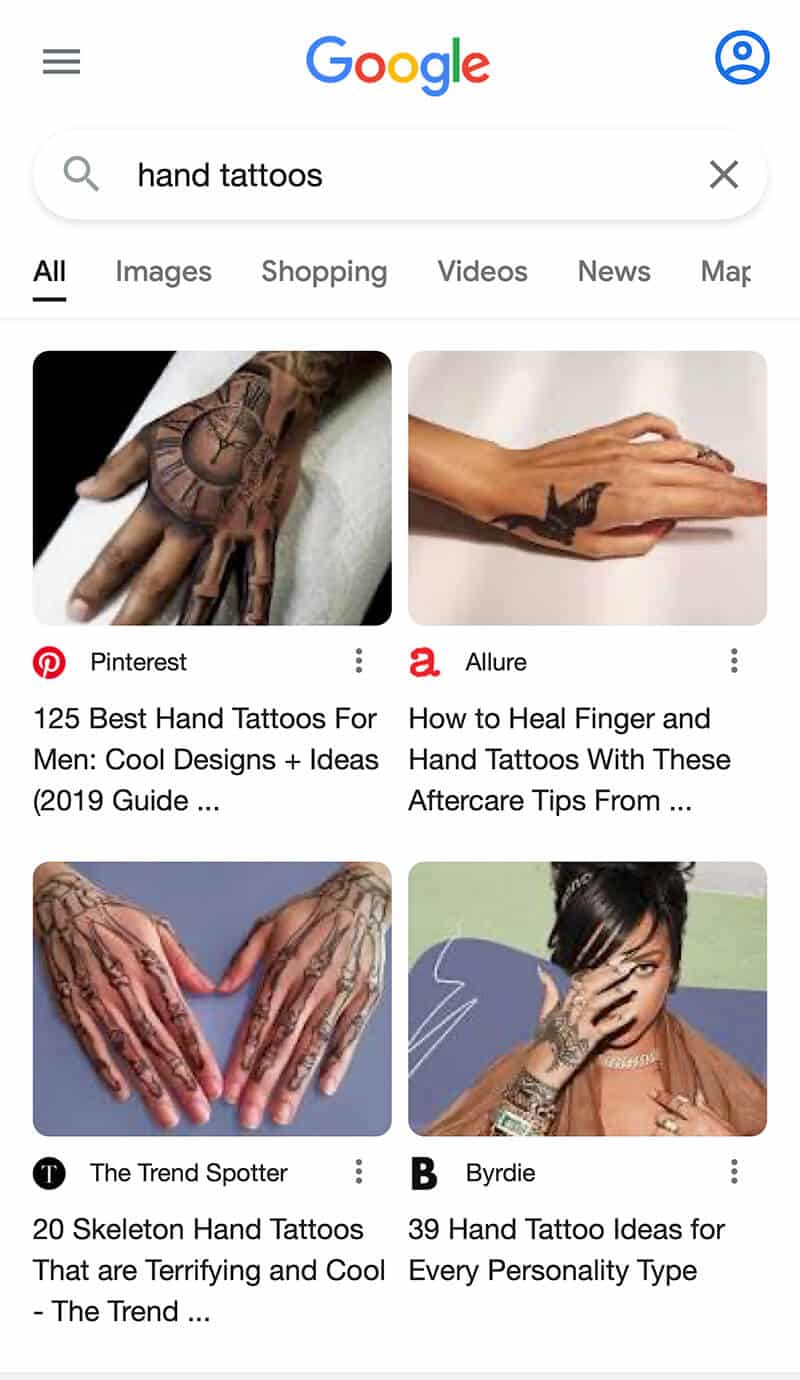
Google has rolled out a new mobile search interface that allows for a more visual look at some search results. A Google spokesperson told us this new interface helps “surface relevant information related to an image, so users have a deeper understanding of the results they’re seeing.”
Mobile only. The new interface is currently live for mobile searches on Google for select queries. You can try it for the query [hand tattoos] or [game room design] on your mobile device.
What it looks like. Here is a cropped screenshot of the new visual look, that shows images in a grid-like interface. If you want a full size screenshot, click here.

Two position ones? I asked Google if the top two results would be counted in Google Search Console performance reports as position one, or if the one on the left is position one and the one on the right is position two? Is that flipped for languages that go from right to left like Hebrew and Arabic? We will update this story when we hear back.
More updates. Google said it will continue to make improvements to the mobile and desktop search results. Last year, Google made several updates to the mobile interface design of search and also launched continuous scroll.
Why we care. This new layout in mobile search may help your site get more (or less) exposure in the search results. In these types of queries, you now have two side-by-side results, possibly from two different sides sharing the first position in a grid format.
This may impact your site traffic, click through rates and performance reports in Google Search Console.
The post Google Search rolls out a more visual search interface on mobile with grid format appeared first on Search Engine Land.
No comments:
Post a Comment