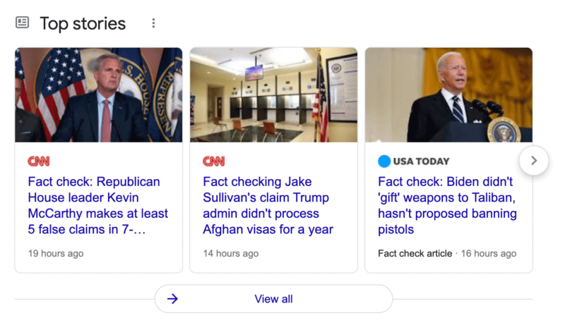
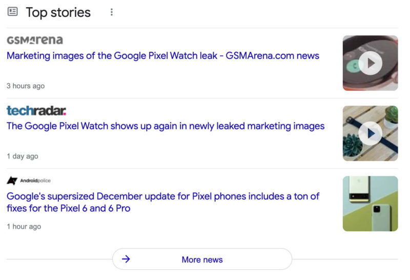
Google is now rolling out a new design for the top stories section in the desktop version of its search results, a Google spokesperson confirmed with Search Engine Land. The new design matches the design efforts of the mobile top stories section that launched about two years ago.
Google’s confirmation. A Google spokesperson confirmed with Search Engine Land that this new design is rolling out globally now. “We’re always working to make it easier for people to dive into the most useful, timely articles available through Search to help them form a better understanding of the world and the topics they care about most,” Google told us. “This newly launched feature is the desktop version of the Top Stories experience you can already find on mobile,” the search company added.
What it looks like. Here are a couple of screenshots of this new look:


Earlier version. Google started to roll out this design over the weekend but tested this design on desktop as far back as a year ago on desktop.
Google’s top stories box view looked like this, but Google also had a list view which had them stacked on top of each other:


Why we care. Top stories can send online publishers a lot of search traffic from Google Search. The new design may end up impacting that traffic, you may see more if you are featured in the large image box or you may see less. Publishers should watch their Google Search traffic and see if this new design has an impact on that traffic.
The post Google rolling out new top stories design on desktop appeared first on Search Engine Land.
No comments:
Post a Comment