Calls to action (CTAs) provide customers with a path to follow to achieve their goals, whether that’s completing a purchase or requesting a consultation. Despite being one of the last steps in the customer’s journey, CTAs have gone overlooked as brands adopt a generic approach in this final, crucial solicitation, using messages like “Click here,” “Join now,” and “Read more.”
Creating descriptive CTAs takes time, but it can also signal relevance to search engines, guide your users and improve conversion rates. At SMX Convert, Billie Hyde, senior account manager at The SEO Works, shared several tactics she uses with her own clients to improve the experience for users while furthering business outcomes.
Ditch the generic CTAs
“There are two types of calls to actions . . . subtle calls to action or glaringly obvious,” Hyde said, “These super obvious ones . . . they appear everywhere on the page, so they can be in the meta description or in the actual content or on the product description towards the end.”
CTAs often serve as anchor text, but generic wording may downplay the relevance of the link for users as well as search engines. Hyde recommends that marketers go beyond these bland CTAs to provide more value.

“Try to put something relevant to the page you’re trying to take users to,” she said. Instead of a CTA like “Browse our collection today,” Hyde recommends “Browse our collection of gold earrings today,” she provided as an example. “So I’m still saying to Google that where this call to action is taking you is relevant for this reason and the page that we’re linking to is what we’re saying it is,” she said, adding that this also helps with internal linking.
If you must use a generic CTA, it’s worth researching and testing whether it actually applies to the content you’re using it for, Hyde added.
Use your CTAs to strengthen the user journey
Your CTAs should be leading users across your pages, educating them about your offerings while nudging them along the journey you’ve designed for them. More subtle, specific CTAs are better suited for this purpose, as they allow you to suggest alternatives (if a product is unavailable) or simply add more touchpoints to build trust.
“Not what you are looking for? Why not browse our collection of colourful prints to add some colour and art to your house,” was one example Hyde provided for situations when a user might leave because they’re not able to find what they were looking for.

“[These types of CTAs] are super helpful because it allows your users to become more informed and they can find exactly what they’re looking for,” she said, noting that informed users are the best type of user because they’re more likely to have realistic expectations, which can increase satisfaction along with the likelihood of future conversions.
Site owners can look to their analytics to assess which page a user might head to next and craft the relevant CTA using that information. “The anchor text that we’re using in the links on this journey need to be relevant to the page we’re taking them to,” Hyde added, “So just always keep that in mind.”
Prioritize differently-abled users
Sites are typically designed on desktop, for abled users. Search engines, like Google, have incentivized improving the mobile experience through algorithm updates like the mobile-friendly update. However, no such ranking boosts exist for sites that are designed with visually impaired users in mind.
“In 2020, there were over 2 billion sales made online, and according to Practical Ecommerce, around 3% of all online shoppers use a screen reader,” Hyde said, “So that means an estimated 60 million online sales last year were made by people who have visual impairments.”

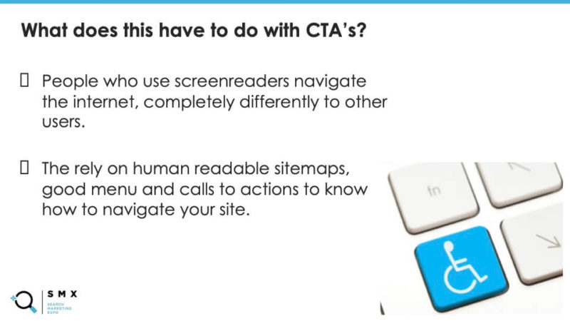
Users that rely on screen readers may not have the benefit of the site’s visual content for context. “If [a CTA is] is ambiguously named, a person with a screen reader is not going to think it applies to them, that’s why you need to say exactly what you want,” she said. Not doing so could leave users stuck on a page, which means you run the risk of losing that conversion.
To avoid this scenario, Hyde recommends that marketers download a screen reader. “Every single client I get it, I take about half an hour to an hour and I use the screen reader to navigate their site,” Hyde explained, “I click every single link I can, I go through the article using it and I just try to understand how this works for users with visual impairments.”
This technique can help you eliminate roadblocks on your journey that may trip up users, regardless of whether they rely on a screen reader or not. Additionally, it can also help you improve your user experience by highlighting ambiguous navigation, for example.
“Your on-page SEO doesn’t just stop at the content and this isn’t technical SEO — this is just being a good human being creating content for other human beings,” Hyde said, “We need to factor them all in.”
Watch the full SMX Next presentation here (registration required).
The post 3 tactics to improve CTAs for increased relevance and conversions appeared first on Search Engine Land.
No comments:
Post a Comment